Expanding a Brand
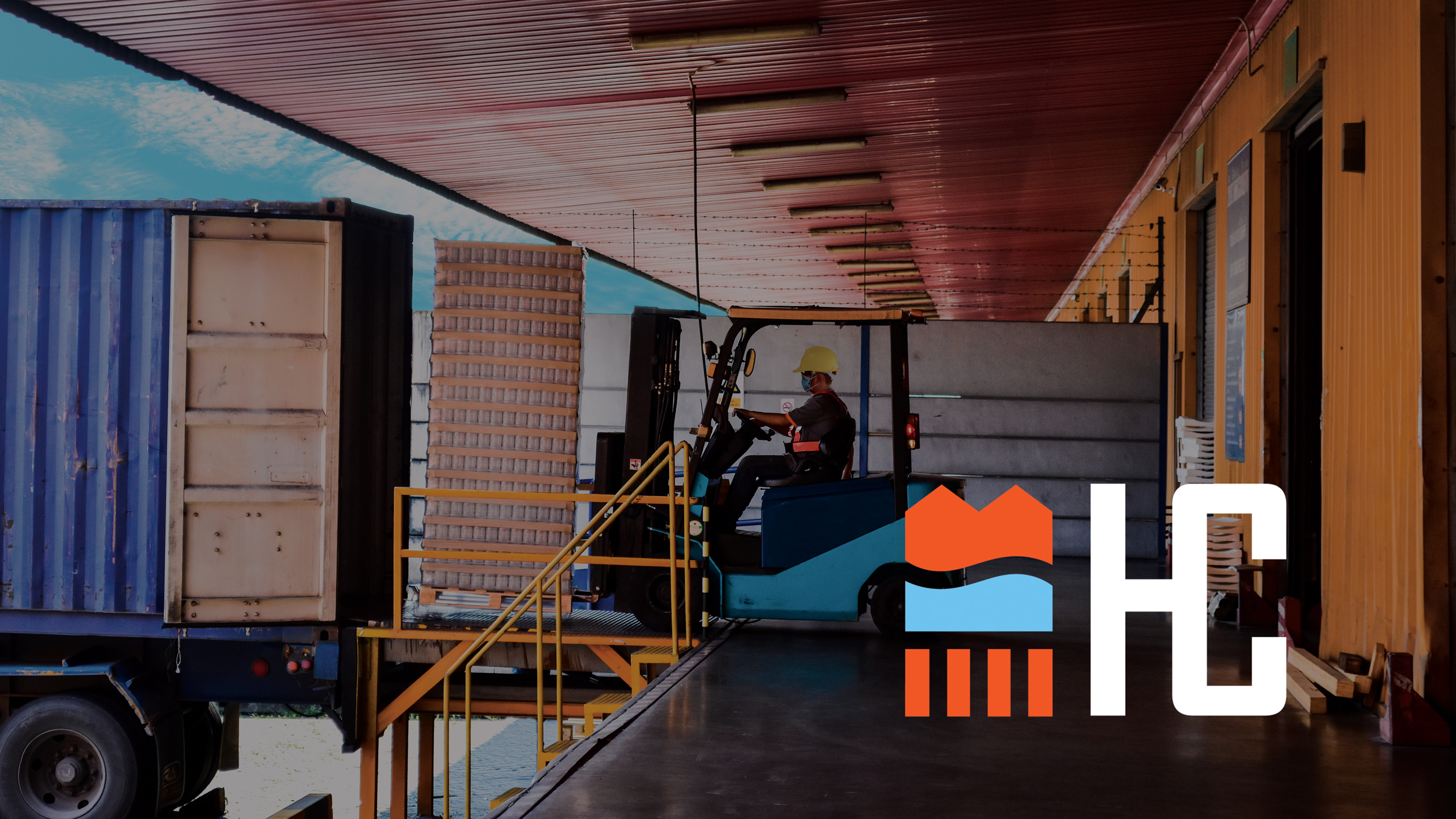
High Caliber came to A38 with the hope of updating their brand to create a more modern look and to expand beyond their existing industry of grain to a full shipping, storage, and logistics company.
The logo was designed to emphasize the broader range of reach and services. The logo icon can be broken into three separate parts – land, sea, and rail.
Website: HCTransloading.com
BRANDING, GRAPHIC DESIGN, WEB DESIGN/DEVELOPMENT